Tuesday, 30 September 2014
Sunday, 28 September 2014
Sound Technology
Sound Presentation
The song i have chosen for my presentation is:
"Mac Miller - Nikes On My Feet"
https://www.youtube.com/watch?v=a-rqu-hjobc
For the parallel slide of my presentation i have inserted images of expensive high end Nike trainers, this is because the rapper in the song is rhyming about buying and wearing fresh new nike trainers and how it makes him feel more complete. this is parallel as it links and accompanies his lyrics, these types of shoes are something the audience would expect to see in the music video (which they do).
Although for the contrapuntal slide, i have inserted images of worn out, low end brand trainers and formal mens boots. This is contrapuntal as we would not associate this in the music video at all and especially in the rap/hip hop genre.
Teacher Feedback:
- Presenting on Youtube works well but is not enough of a jump between the two collages.
- Does the presentation rely on listening to/knowing the lyrics rather than the feel of genre of the music?
- Importance of brand to hip hop culture is a very valid point and shows media thought.
Thursday, 25 September 2014
Film Noire (Scarface 1932)
In this clip of the classic, film noire Scarface we can see that the lighting used throughout is Low Key lighting, we can suggest this prior to the high effect of chiaroscuro. They may have used low key lighting in this scene to give a more dramatic, intense feel for the audience.
In Film noire, the Key Light and Back Light are most important. The Filler light may be used but it isn't the most dominant. Most Film noire movies tend to use hard lights. Hard lights
leave sharp edged shadows because the light is using a single source point of light. Soft lights create fuzzy shadows has the lights are scattered to many different points. Hard lights are the most used lights for a Film noire look. Soft lights are used to mainly glamourise female characters.
Lighting
Lighting: Low Key
Position Of Light: Key light placed on right of subject with under exposed filler light placed on the left of subject
Effect Created: This creates a dramatic look due to the low key lighting, this lighting also tells us about the character and how she may be a dangerous person as there is a lot of lighting on the smoke rather than her face.
Lighting: Low Key
Position Of Light: Top Light with a reflection coming from the right of the subject.
Effect Created: Dramatic, almost horror type look. The sense of the dark shadows coming from below her face may suggest that she is trying to escape from something. We can also suggest that this is Low Key as there is a strong effect of chiaroscuro.
Lighting: High Key
Position Of Light: Top Light, this is because of the harsh shadows under his eyes, nose and facial areas.
Effect Created: Makes this character look more like a king and shows off his outfit, also shows power and seriousness due to the top light shadows on his face.
Lighting: Low Key.
Position Of Light: Top light with an under exposed filler light on the right of the subject.
Effect Created: Very dramatic scene due to the very dark lighting and black and white effect, the lighting is mainly exposed on the prop (gun) and characters facial expressions which tells us he isn't a man to mess around with. We can also suggest that this is Low Key as there is a strong effect of chiaroscuro.
Lighting: Low Key
Position Of Light: Key light is entering from left side of image, there is no filler light.
Effect Created: The type of lighting is arguable as the subject is well lit although there is a high contrast between light and dark as shown in the shadows, the use of only using one key light and creating a large harsh shadow suggests that this picture is related to thriller.

Lighting: High Key
Position Of Light: Right side though window.
Effect Created: The light is high key as the lighting is natural and coming in from outside although it creates some drama as there are many dark shadows on the subjects.
Lighting: Low Key
Position Of Light: Strong key light directly in front of subjects. No filler light.
Effect Created: This creates thriller and suspense as this lighting forms very large shadows that are taller than the characters which may mean there is a different side to the characters in the image.We can also suggest that this is Low Key as there is a strong effect of chiaroscuro.
Lighting: Low Key
Position Of Light: Key Light is hitting the right side of the subjects face.
Effect Created: The gritty wall and the dark shadow suggests that this is related to a horror genre, her back is also facing the light and she looks as if she has seen something unusual. There are also dark shadows around her eyes. We can also suggest that this is Low Key as there is a strong effect of chiaroscuro.

Lighting: High Key
Position Of Light: Top Light with a possibility of filler light on the right side of subject.
Effect Created: Shows us more detail of the characters facial expressions but yet makes her more glamourous.
Lighting: Low Key
Position Of Light: Back Light
Effect Created: A very dark, scary image. We can tell that this is Low Key lighting as there is a strong effect of chiaroscuro. The effect of backlight shows a sense of mystery and horror as the subject is very dark and almost unrecognisable.
Lighting: High Key
Position Of Light: Right side of subjects
Effect Created: The type of lighting is arguable as there is a slight effect of Chiaroscuro although both subjects are well lit. The reason for why this is arguable is because the women as slightly under exposed and has shadows behind her, this may suggest that she isn't a good person and may not be the best women to be with for the male character.
Tuesday, 23 September 2014
Chosen Advert (CRS: Change A Life) Analysis
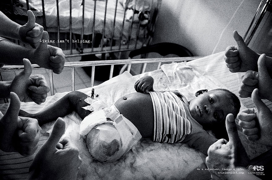
Colour:
This advert is in full black and white, this shows negativity and seriousness. This relates well to the theme of the advert as its a very serious topic. There is also a heavy grain filtered on this image to give it a very dull and sad look to the viewers. Having this dull and negative look will keep this advert imprinted in the audiences brain as they may think back to how sad this image is, they wouldn't be able to be affected by this image as well if it was in full colour.
Setting:
In this advert, we can see that the setting is inside a unclean, poor hospital. This is because the sheets on the patients bed is very dirty and creased up. This shows that this poor, sick young patient is living in extreme difficulties in a third world country as he isn't getting the best treatment. This may show how fortunate people in the UK are as they get top quality medical care where as children in need do not. This is important as it keeps a serious and very negative feeling in the audience which helps create a more effective, powerful advert.
Lighting:
The lighting in this image is High Key as it is lit by natural light. Although the shadows are very harsh and dark which shows drama, negativity and seriousness. There is also some slight vignetting which brings more attention to the centre and in this case it is the young patient, this is very effective as he is the main subject. The hands coming out the sides of the image are very dull as they are coming out the shadows. The hands represent social media Likes and how images of third world crisis' are always being uploaded to social media and gaining likes but the likes don't help the cause at all. This is why the hands are lit to be coming out of the shadows.
Size/Framing:
The subject and focal point go the image (the young patient) is zoomed into to fit the frame to give the illusion of him being very big, where as the hands representing likes are rather small which show importance. It shows that the young boy is the main importance of this crisis and the likes don't mean nothing at all. The copy is very small and simple to show seriousness and maturity. It shows that the image is powerful enough to speak for itself, which it does.
Pose:
The young boy in the hospital bed has a very straight face and maybe even a little confused. He may be confused to the thumbs up around him as this can signify the likes social media receive but don't make a difference. The pose of the hands are thumbs up which signifies how likes don't help the real cause.
Subject Matter:
Many bad things are happening in this world, but yet there are people that are uploading images about these causes only for attention and 'Likes". this image shows that these "likes" do not help the real people that are being untreated at all. They have used this type of cause as they're are many children that are dying everyday and yet many people do not help at all but just talk about it.
Composition:
This image is composed very well as it is very simple and minimalistic but very, very powerful. The director has come up with a very affective idea to link a real life problem that happens every day with something people use and interact with everyday. A simple click of a button can produce a like where as a click of a button could also help someone in need.
Thursday, 18 September 2014
Poster Analysis
Poster Analysis
Blade Runner:

Blade Runner:
In this poster we automatically suggest that this film is going to be in the sci-fi genre, we can tell due to the chosen images in the poster. There seems to be some sort of galactic skyline and lots of stars. There are also lots of sun rays which suggests that this film is set in outer space which also relates to sci-fi. We can also tell that the sub genre for this film is action as Harrison Ford is holding a gun in a very anticipating pose, he seems ready to fight. The female character has a 40s / 50s film noire style to her. This emphasises her feminine figure. The fact that she is smoking may also suggest that she has more of a dangerous side to her personality which is further shown due to the very harsh shadows behind her. We may also be able to tell that harrison ford is a heroic figure doe to the gold flares around him although the fact that the flares are pointing away from him may suggest that he has more of a villainous side to his character. The font also tells us that it is going to be a sci fi film as this was a typical sic fi font in that generation.
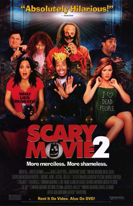


Scary Movie 2:
In this poster we can tell it is going to be a Horror Comedy, this is because the bold large font of the movie title is called "Scary Movie" when the copy at the top right clearly indicates it will be a comedy. We can also tell it will be a parody as the characters and actors used in the poster are represented as other characters of horror films released at the time. this poster also highlights a common stereotype of black actors dying first as the lead black actor in the poster is posing like he is about to be murdered while everyone looks shocked. Also, the colours in this poster is very vibrant which creates a positive mood to the audience.
UZAK:
From this poster, we may suggest that the genre is going to be a Drama with the sub genre of mystery, this is because the colours are very dull and negative, also the lead character isn't facing the audience and is blacked out which creates the sense of mystery. The setting also seems very disturbed and negative which leaves the audience asking questions about what may have happened and who this character is. In the bottom left side of the poster instead of writing the release date the designer has written 'Starts 28 May' which tells us that something is about to happen but we don't know what it is, we must watch the film in order to find out.
Im Not Scared:
Just by looking at this poster we can indicate that this film is going to be about a young boy who is all alone on a scary journey/adventure. Also there is also some irony as the title of the film is called "I'm Not Scared" although the boy in the poster seems to be rather scared and frightened. We can tell that the genre is horror as there is a lot of tension in this shot as we don't know what the boy is scared of or what is inside the whole he is frighteningly staring at. The target audience aims to be at teenagers that are in for a thrilling journey.
Pirates of The Caribbean - Dead Mans Chest:

Just from the title of the movie we can tell that the storyline is based upon pirates that are after a chest. We can tell that this movie is going to be an action/adventure as the lead character is holding a gun and there are boats at sea with a ghoul theme to it, this also shows that this film may be quite frightening, We can also tell that the man holding the gun is the lead character as he is larger in size compared to the other actors. The colour scheme is also very old aged and medieval. The target audience seems to be kids - young adults.
Bride And Prejudice:
We can tell that this movie is going to be about a wedding due to the title but also because it is a twist from the original "Pride & Prejudice." From the pose of the lead character we can see that these two people are going to get married but are going to face a lot of funny problems and delays to their final wedding. We can also tell they are going to get married as there is a lot of confetti flying around them. We can also tell that there are going to be problems as the male is of a Caucasian ethnicity where as the bride is Asian. It is going to be a problem as the background shows the setting of india with a lot of indian people, it is very un common and strange for an indian girl to marry a Caucasian so there will be a lot of problems. This film is aimed at young adults and adults as it is based around marriage and romance.
Million Dollar Baby:
This poster shows that the film is going to be based around sports and boxing. We can tell that the female in the image will be the lead boxer as she is in boxing clothes and we can also tell that she is training for something big due to the title. She is facing away from the camera but is watching her back which shows a sense of authority and awareness. This relates well to boxing. The hair and clothes in miss-en-sense is a alternative stereotype as she is taking the manly role in the film. The other characters are facing the camera and are older which may show a stereotype that the older are wiser and more serious. Her facial expressions are serious which may suggest this is a drama, the black and white effect and low key lighting connote mystery and a sense of drama. the characters also appear from darkness which also creates mystery. This poster is very simple and serious which tells us the target audience are young adults and adults, also the simple and small font connects to more of a sophisticated, mature audience.
50 Cent Reebok Advert Analysis
50 Cent Reebok Advert:

*Denotation is shown throughout*
Type Of Shot:
The picture shown in the advert is a close up black and white portrait of 50 Cent. The close up is very useful in this advert as you want the audience to recognise him as he is the celebrity endorsement in this advert. This has the effect of attracting millions of his fans. This is good for reebok as if 50 cent wears reebok and endorses it well, a majority of his fans will also do the same. There is also an image of finger prints which has been shot from direct up above which allows up to tell what the image is clearly with a good understanding.This helps the audience know what it is straight away without looking at it for a long time as most people see printed adverts in places where they are on their commute.
Setting:
The portrait has been shot in a photo studio and have taken the image with a black backdrop, this is beneficial as it is plain and not distracting as it lets the audience focus on 50 cent. The fingerprints are also plain to to show how they focused on making sure the audience can see the finger prints in detail. From this, we can tell that the advertising team for reebok have not worried or focused on setting as they had to make sure every thing else in this shot that can help sales is done well and to perfection.
Lighting:
The lighting placed on 50 cent isn't very exposed and well lit which creates a very serious and negative type of mood to the audience. There is also some Mise-En-Sense used as the lighting is mainly touching his face which brings all of the attention on this celebrity endorsement.
Colour:
The colours used in this advert are very un saturated and dark, there are colours of black and grey which creates a negative, cold and serious atmosphere. The dark, moody colours could show how 50 cent has had a terrible past life and even though he is now a celebrity and a successful rapper/business man his past life still creeps up behind him.
Framing:
The image is placed on the left side of the page as it is the first thing the audience may see as we read from left to right. The copy is placed at the very top of the image of the finger prints which is on the right section of the print. 'I am what i am" is in bold and is placed at the centre of the print to which works very well for advertising as this will remain in the audiences head.
Size:
The size of "i am what i am" is considerably larger than the rest of the copy which suggests that this is the main heading or title of the advertising campaign. The quote by 50 cent is bold but not as big as the title to show that it isn't as important but is still very relevant. The reebok logo is a lot smaller than the rest and isn't in a good area, i don't think this is the best option but does let the audience know what brand/company the advert is for.
Pose:
50 cents facial expressions are very negative, angry and serious. this corresponds well with the rest of the theme. He may be making this facial expression to show that he didn't like his past life and he will not go through the stages of trouble he was at before. The body isn't shown which shows that they really wanted to emphasise his face and facial expressions.
Subject Matter:
50 cent was a man of a hard life and touch backgrounds, he has now changed to be a more better person, i think that reebok have used 50 cent and the finger prints to show that anyone can wear their clothing and its never too late to change. This could show that the target audience may be people with hard backgrounds that look up to people like 50 cent.
Composition:
The layout is very minimalistic and simple, this may suggest that reebok wants anyone to have their products and that its a straight forward product to purchase. Simple layouts may be very risky in advertising but in this case i think it wins, its a great straight forward, well composed print advert.
Tuesday, 16 September 2014
Mise En Scene
Mise-en-scene:
Mise - en -scene is a french term that roughly means "put into the scene." It recognises the attributes of a film, the settings and actors, costumes and make up, props, and all the natural and artificial details that are in the spaces filmed (frame).Still Image Analysis:

In this still image taken from the hit TV show "Breaking Bad by Vince Gilligan" we can see that this character has been fatally injured by some sort of explosion. We tell that he has been injured due to the artificial graphic on his face. We may also suggest that this was caused by an explosion as the room he had just left has a large amount of smoke left inside it. From this still image we can also learn a lot about this certian character. We can tell that he was a person of high status and was reasonably wealthy due to his costume. He is wearing a royal blue suit which may have been quite pricey. We may also suggest that he has a high status because although he is severely injured and looks as if he is about to die, he still takes his time to assemble and sort out his tie, this tells us how he liked to keep his image. From his facial expressions we may also suggest that he knew who had done this too him, this is because he looks more upset than shocked.
Genre Analysis:
The three extracts i used were:The Conjuring (Horror)
Tron: Legacy (Sci-Fi)
22 Jump Street (Comedy)
In 'The Conjuring' the overall look is very unsaturated and dull, the settings are also very old and gritty. The props consist of positive objects such as toys but have a very negative meaning to them in the film, we can tell as a kids doll is moving and is writing horrifying things on peoples walls with blood. This is all done in order to set a scary, phycotic illusion to the viewers.
In "Tron: Legacy" there is futuristic, fictional look to it. A man goes into a digital world to save his father and bring him back to the real world. The props consist of robotic motorbikes, digital cars, futuristic light sabre weapons and discs. The setting is a digital created universe with two colours, orange and blue, blue being the good side and orange being evil. All of these elements help create a more intense realistic experience for the viewers.
In "22 Jump Street" there is a more saturated, happy look. This is because the director want to keep the audience in the most positive mood possible as its a comedy. The setting is in a college with a lot of youth actors, this is because the target audience is aimed for young adults, the props consist of guns and police equipment as the lead characters are undercover police and that this film is also a comedy drama. The clothing are very modern casual clothing as they are in a college.
Overall the Mise-En-Scene in each of these films are very different, they have to be in order to keep the films in their genre and to make sure the audience know what the dilm is going to be like and what is going on.
Thursday, 11 September 2014
Media Consumption Worksheet
Media Consumption:
Newspapers:
The daily newspaper i tend to read is my local Southall Gazette. I usually read the main headlines first as they are mainly very interesting and very eye-catching. The sections i never bother to read are things like homes and property or share prices as they are not relevant in my life. I enjoy reading crime stories as the crimes that take place are local. It lets me know what is going on around me. I also enjoy keeping up to date on business stories as i study AS Business. My family also read the Southall Gazette.
Magazines:
I am subscribed to the Digital Camera magazine as do a lot of photography and videoography with DSLR cameras. I like to keep up to date on new camera products and modern technology. I also read this magazine as they showcase great photos taken by readers, they also give lots of tips and help for various styles of photography. i tend to read mostly all of the magazine.
Television:
I approximately watch around 5-6 hours of television a week. i usually watch TV before i go to bed and i enjoy watching movies or TV shows. I mainly watch TV alone.
Radio:
My favourite radio stations are BBC extra and Westside FM, this is because i enjoy listening to Hip Hop/ Rap music. The only time i do listen to the radio is when I'm in the car on a journey. i dislike talk shows as they can get quite boring. As i’m in the car listening to the radio, i listen with others.
Cinema:
The most recent movies I've seen in the cinema are: Dawn of the planet of the apes, Purge: Anarchy, Transformers: Age Of Extinction, 22 Jump Street and X Men: Days Of The Future Past.
I am also subscribed to Netflix and Sky Movies, i have recently watched: Paid In Full, Wish You Were Here, Gravity, Life Of Pi and World War Z. I mostly watch Netflix and sky movies alone although, i watch movies in the cinema with my friends.
Internet:
I access the internet everyday, i use the internet at home, at school and even when I'm out and about. The mainly use social media, such as twitter, Instagram, Facebook and snapchat. I also spend a lot of time on Youtube. i use social media to stay connected and to keep up whats on whats happening. I use Instagram so i can see other photographers and videographers work as well as also keeping connected with my friends. I use youtube to see interactions on my channel and to watch videos and listen to music.
Wednesday, 10 September 2014
Why I Have Chosen AS Media Studies
I have chosen AS media as I have have a strong track record in media. I have directed and shot many music videos and have a photography portfolio. I have worked with companies such as BarclayCard and I've also worked with many upcoming artists. I've also shot photos for events with many clients. I also chose AS media as I enjoy learning new things in something I love doing. I also hope to carry on Media Studies further after sixth form.
Subscribe to:
Posts (Atom)